Period homes ask a lot of a curtain. Sash windows sit close to cornices, bays refuse to take a straight pole, and a low beam can make a full-length drop feel like a mistake. Linen is forgiving in all of them, but only when the colour, lining and heading are chosen for the architecture rather than for the swatch. Here is how to match the three.
Most curtain mistakes start with the width, not the colour. Work out two things before you order a metre of anything: where the curtain will hang from, and how much wall it will cover when it is open.
Cottage windows sit in thick walls with deep reveals, so a track fitted inside the reveal often looks tidier than a pole fighting an uneven wall. Georgian sashes usually want the opposite treatment: a pole or track mounted above the architrave, near the cornice, with the curtains falling clear of any internal shutters. Victorian bays need a track that bends, or a separate pole for each angle. One straight pole across a five-sided bay never works.
Stack-back matters more than most people expect. On a narrow terrace wall, a pair of heavy curtains can cover a third of the window even when it is drawn open. Three measurements to take before you buy:
Low ceilings and small panes do not suit grandeur. A full-length curtain on a tiny window can look as though the fabric is winning, so either commit properly to floor length to exaggerate the height, or keep kitchen and bathroom windows short with a simple café curtain.
Colours work best when they sit close to the walls: chalk white, oatmeal, a soft grey-green, dusty blue, faded brick red. Strong contrast in a small space pulls the eye to the window and shrinks the room. Washed linen is worth the extra, because it has done most of its shrinking already and hangs with a softness that suits old plaster.
Headings should stay relaxed — pencil pleat on a slim track, or eyelets on a simple pole. If the walls are lumpy, and in a cottage they usually are, a track on brackets you can pack out will save you hours of fiddling.
Georgian windows are tall, narrow and often arranged in pairs, so symmetry is doing a lot of the work. Hang curtains the same distance from each window edge, and give each curtain the same number of folds. Where there are two windows, treat them as a matched pair even if one is used far more than the other.
Mount the pole or track high, close to the cornice, and run the curtains to just brushing the floor. That taller line makes the ceiling feel higher than it is. Deep colours suit these rooms: indigo, olive, deep green, damson, a warm ochre. If the room faces north and feels dim, a warm undyed linen will lift it without losing the formality.
If the windows have internal shutters, stack the curtains beside them rather than across them, or you will never open both. Interlined linen is the natural match here: the extra weight holds a pleat and slows a draught.
Victorian front rooms often have a bay, high ceilings and more architectural detail than the eye can take in at once — cornicing, a ceiling rose, a picture rail, a dado. Plain linen is the calmest answer. Skip the trims, the contrast edging and the elaborate pelmets; let the plasterwork be the decoration.
For a bay, a single wave track that follows the angles gives the cleanest result. Separate poles per section cost less and are easier to fit, but you will see the break in the fabric every time you look at the window. Measure each angle separately and allow a little extra on every panel, because bays are rarely square.
Where the room is dark, which is common in a mid-terrace with a north-facing front, undyed or oatmeal linen will bounce what light there is around the room and keep the space feeling calm rather than gloomy. Avoid heavy prints or tight weaves that swallow the daylight; a loose, washed linen in a pale neutral is the better ally.
Period homes leak heat. Sash windows rattle, floorboards gap, and a single-glazed bay can undo an hour of radiator warmth. Linen on its own is beautiful but thin; it will not stop a draught. The answer is a lining, and sometimes an interlining.
A standard cotton or poly-cotton lining protects the linen from sunlight and gives the curtain a cleaner back. For period properties, though, an interlined curtain is often the better investment. Interlining is a layer of cotton flannel or domette stitched between the linen and the lining. It adds weight, improves the drape, softens noise and cuts heat loss noticeably. In a Georgian drawing room or a Victorian bay, interlined linen hangs in deep, deliberate folds rather than flapping about.
Note the trade-off: interlined curtains are heavier, so your pole or track must be fixed into something solid, not just plasterboard. Use heavy-duty brackets and, in old walls, consider a wooden batten screwed into the studs or masonry. Blackout lining is useful in bedrooms, but it can make linen look stiff. If you need darkness, choose a blackout lining that is separate from the interlining, or use a blind behind the curtain.
Linen changes colour with the light. The same oatmeal fabric can look creamy in a south-facing room and almost grey in a north-facing one. That is why testing a sample against the actual wall, at different times of day, matters more than any trend.
For period homes, draw your palette from the materials already there: old pine, brick, stone, lime plaster. Undyed, oat, flax and chalk white are safe starting points. From there, you can add period-appropriate colour. Georgian rooms carry deep, saturated shades well — think Prussian blue, olive green, oxblood, mustard. Victorian interiors often suit richer, warmer tones: terracotta, damson, forest green, and the muddy pinks that were common in the later 19th century. Cottages, by contrast, stay quiet: soft greys, faded blues, gentle greens, and the occasional wash of warm red.
If you want pattern, keep it simple. A narrow stripe or a small block print in a matching tone adds interest without fighting the architecture. Avoid large-scale florals on small cottage windows; they overwhelm the panes. In a tall Georgian room, a subtle damask or a fine check can work, but plain linen with a beautifully chosen colour almost always looks more expensive and more timeless.
A practical guide to visible mending, patching and cutting down worn linen sheets — plus simple projects that turn...
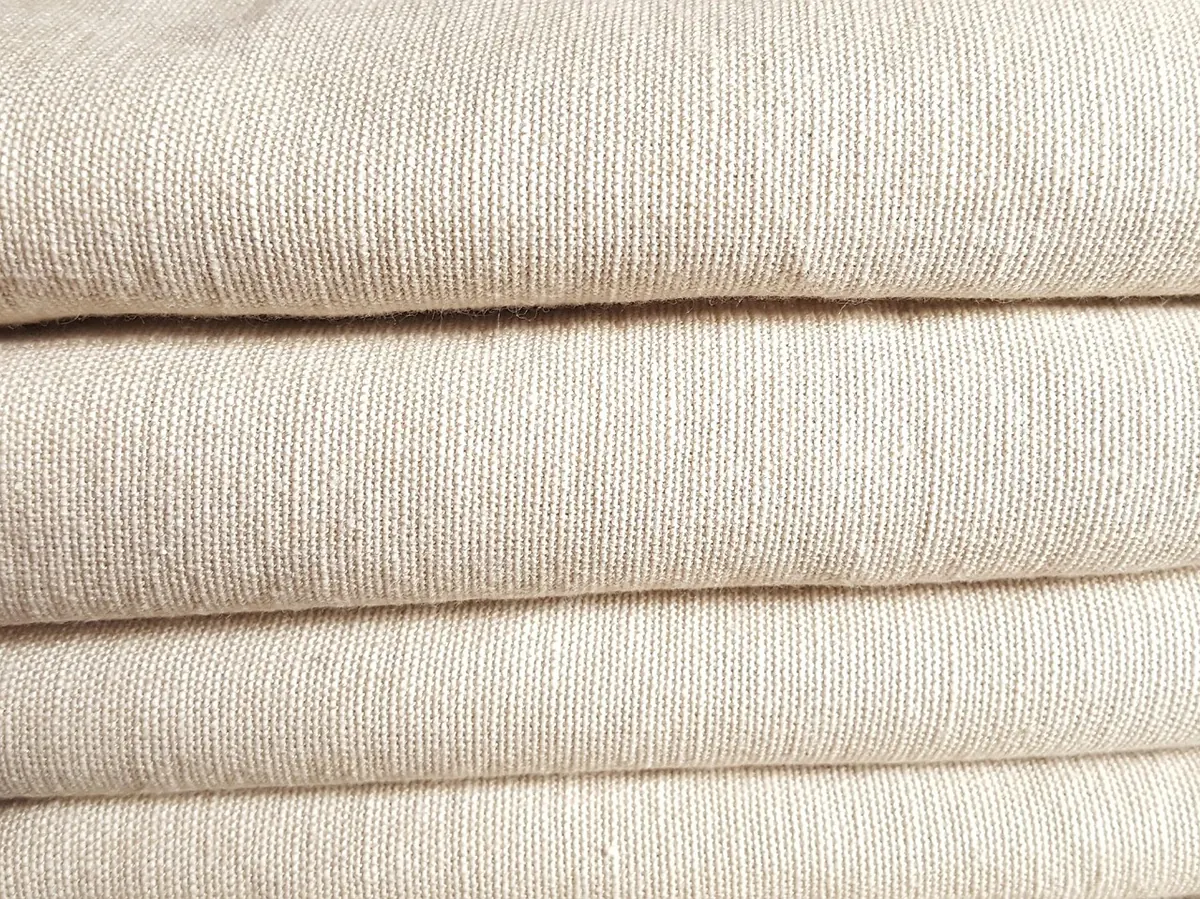
A practical guide to common linen weaves — plain, twill, herringbone, basket, sateen and huckaback — explaining how...
A practical, stain-by-stain guide to treating tea, wine, grease and ink marks on linen tablecloths — without...

Celebrating the beauty and versatility of linen..
